


Words by SODA team
22 Aug 2024
Circularity and functionality: the principles behind Aesop’s retail design
SODA speaks to Aesop’s head of retail design Jean-Philippe Bonnefoi on designing the new Brompton Road location and delves into the brand’s guiding principles, from the packaging to the product formulas.
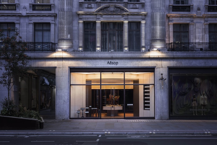
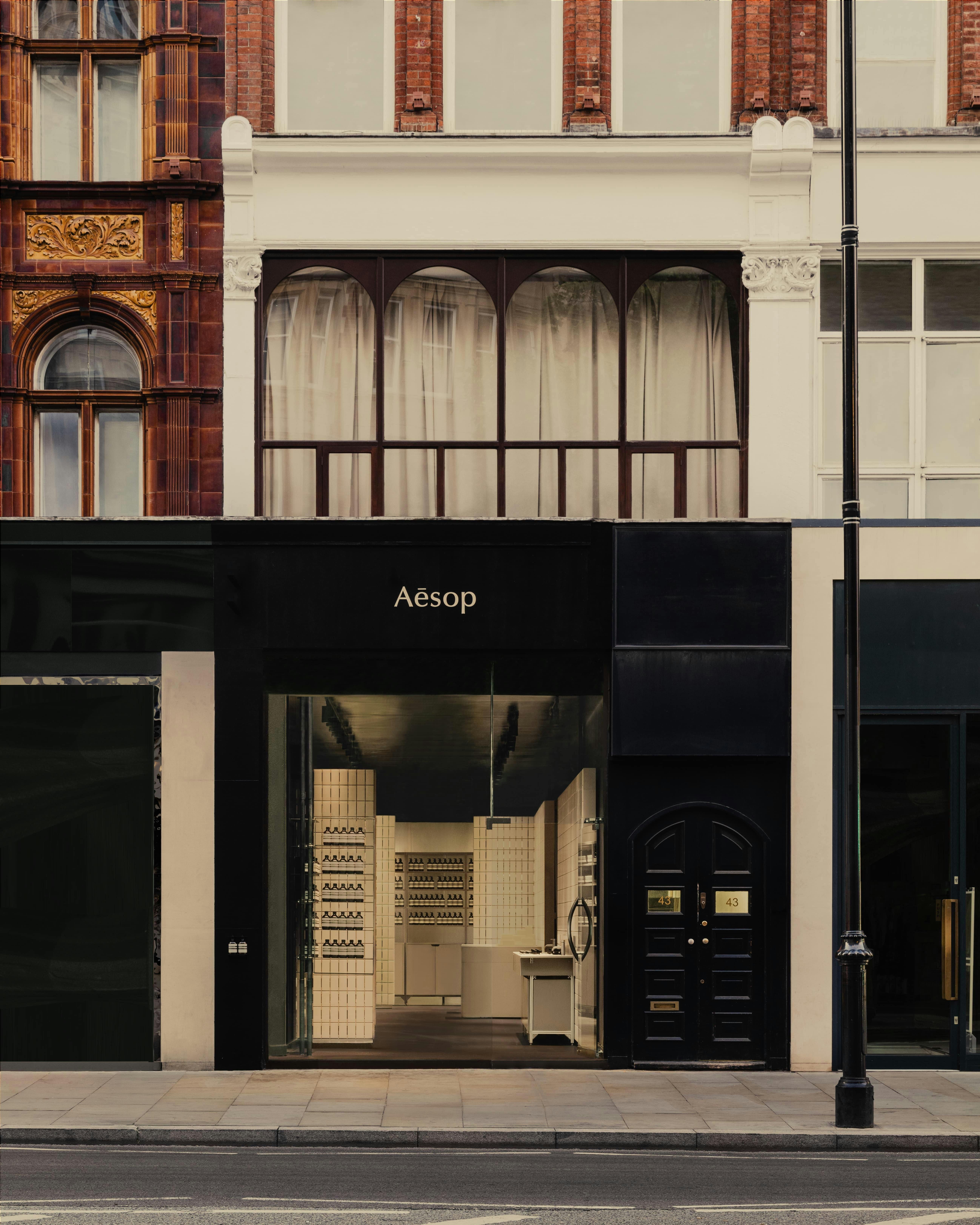
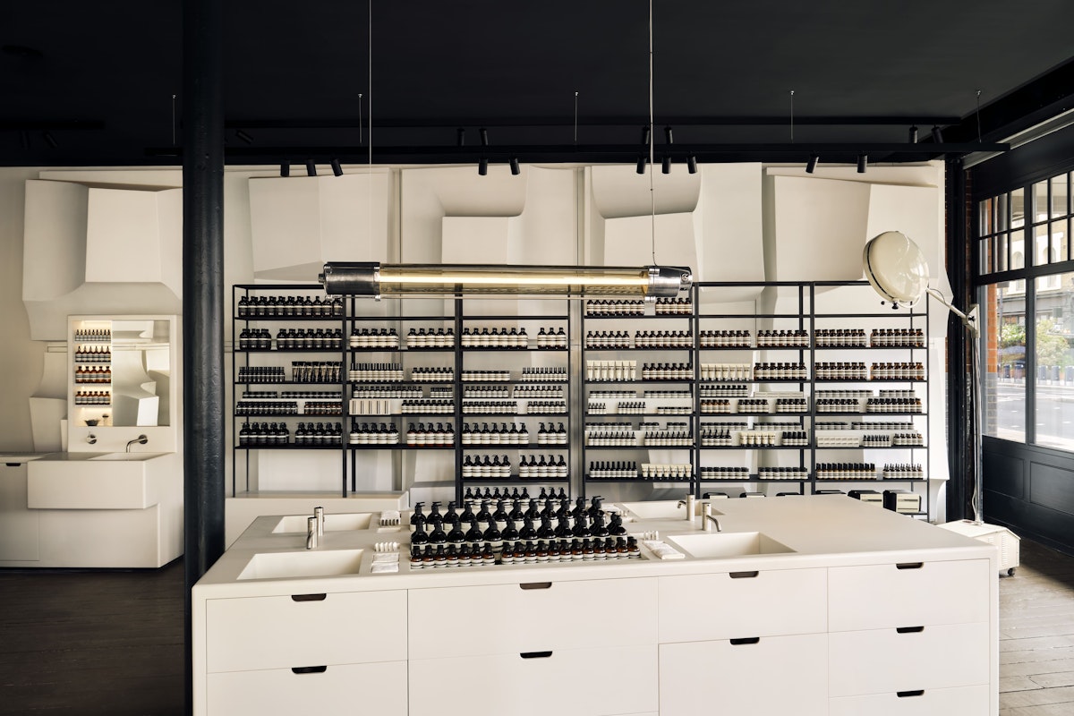
When you walk from the busy Knightsbridge high street into Aesop’s new store, it's impossible not to be overcome by a sense of calm and serenity. It offers a sensory experience from the moment of entry, the most noticeable element being the beautiful, clean aromas.
On first glance, the walls of Aesop Knightsbridge look as if they are clad with ivory tiles but, as you walk further in and make contact, you’ll feel the smooth and permeable surface of thousands of soap bars - 4,500 to be exact.
Before coming to London, the walls of soap made their debut at Salone Internazionale del Mobile 2024 as part of an installation by Nicolas Schuybroek called Form Follows Formulation. They were originally housed in Aesop’s Piazza Cordusio store in Milan for the duration of the design week, but were always intended for the newly opened Knightsbridge location.
The idea was to create an installation for the festival that could be used after the week was over, not only for the sake of sustainability but also to make the project palatable from a business perspective. To convince Aesop management that the installation would be a worthwhile venture, it was decided that it would eventually end up in a store.

Aesop Knightsbridge. Credit: Alixe Lay
On the overall concept of the installation, Aesop’s head of retail design Jean-Philippe Bonnefoi says: “The idea was to use everyday materials that we all use but don’t really pay attention to.”
The structure was ultimately inspired by the Arte Povera movement from the late 60s and 70s, and echoes Superstudio’s contemporaneous monochromatic grid structures.
However, the project didn’t come without its challenges. In fact, Bonnefoi jokes that it made the design team “age faster” due to some issues with the size of the soap bars. He says: “In architecture and at Aesop, we always say plan B.
“We designed all the structures to hold the soaps and then, when they sent us a batch, the soaps did not fit into the structure by one millimetre”. To rectify this, the team held a carpenter workshop where all of the soaps were shaved down by hand to fit into the wooden support structure.
Designing a sensual experience
Standing in the Knightsbridge store, you could see how the walls were reacting to light and heat, almost breathing and sweating as skin would. It was a truly transportative experience, although there was some difficulty convincing visitors to truly embrace it in the midst of Milan Design Week.
For the Milan installation, Bonnefoi says they closed the door and the curtain so they could control the space. But very soon, they noticed that people were entering, walking to the end of the space and then leaving immediately, without taking notice of their surroundings.
The turning point came when the team on the ground started to tell people that the walls were made of soap upon entry, and then they saw how people began to walk slower and experience the space more thoughtfully.
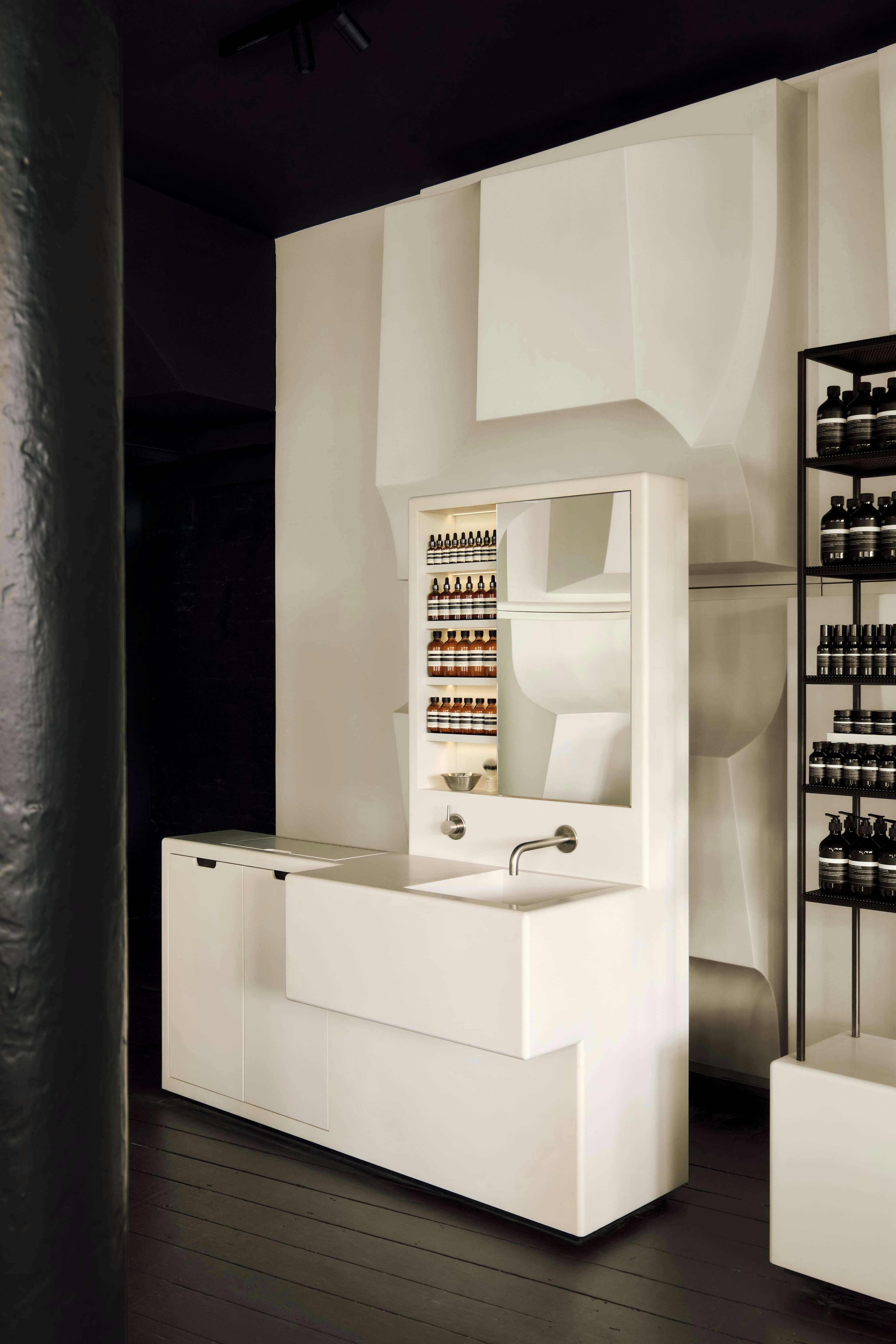

When it came to the sensory elements, it was decided that having nearly 5000 scented soaps in a space would have been overpowering. As a result, Aesop only added essential oils to 20% of the soaps, which are identifiable through a slightly darker colouring.
“Soap isn't like wax,” says Bonnofoi. “It won’t melt, but it will scratch, and the soaps in the Knightsbridge store are meant to be experienced.”
He explains how Aseop’s “warmth and tactility” is its differentiating factor, adding that there’s “nothing precious or luxurious” about what it does.
“So much in our world is polished and perfect and I hope that in three years time these walls will be curved and have the traces of all the people that have been here on them.”
Subscribe To Our Newsletter
Catch up on all the latest news from State Of Design Affairs right in your inbox.
Reclaiming and reusing
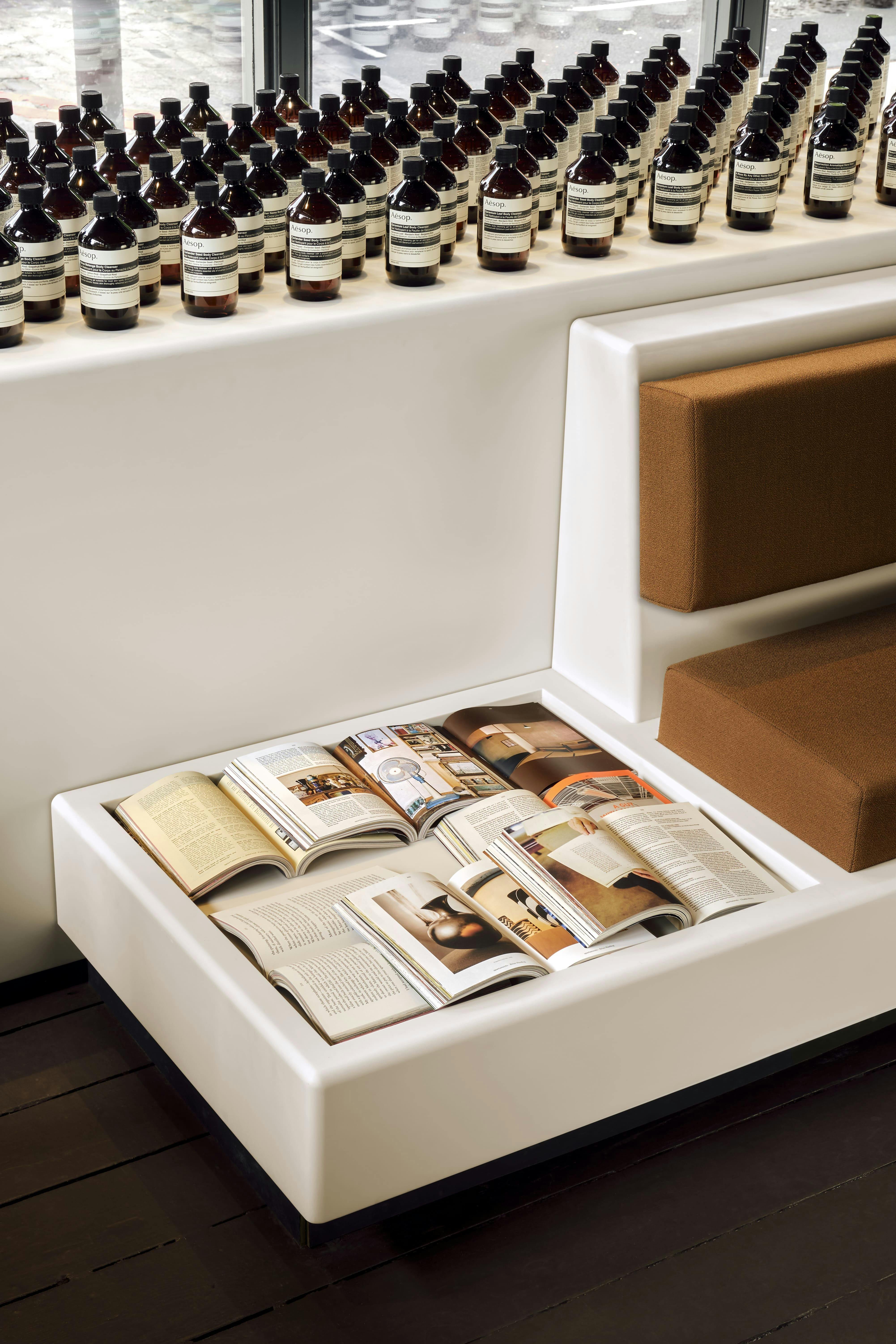
Sustainable principles are in Aesop’s DNA and have been integral since its foundation 37 years ago. In the spirit of these principles, Aesop’s retail design team always tries to reuse elements from other stores or buy second hand where possible.
For example, structures from the recently refurbished Spitalfields store, like the sinks, counters and shelving, have been given a second life at Knightsbridge. To support this method, Aesop's stores generally don’t have built in structures and things like shelving units are designed for disassembly and reassembly.
The new Spitalfields store design is an excellent example of how far Bonnefoi and his team are willing to go for the sake of sustainability. Since Aesop first arrived in London, all of its stores here have featured Lassco vintage furniture pieces and it was no different for this second iteration of Spitalifields.

Aesop Spitalfields
One day, when the team were looking on the Lassco website, they found a listing for abstract fibreglass shapes that appeared to be sold out. The material was previously used for the facade of Leo’s Supermarket in Falmouth, Cornwall, designed in 1984 by British polymath Paul Mount.
Determined to source these panels for use in the store, the design team were able to find a man through Facebook who had purchased around 20 of the panels and convinced him to sell them to Aesop. Bonnefoi says: “He’s very proud that they ended up in Aesop and brought his whole family to the store.
“We don’t have the budget of Hermes at Aesop but we have the ambition.”
Aesop Spitalfield’s fibreglass sculpture is a grid of repeating, abstract forms in high relief. Each pod is one of five different casts, rotated individually to create a vast shadow-wall.
Intentional minimalism
The skincare brand’s minimalist style is not for the sake of a trend, according to Bonnefoi. It is applied in terms of “reducing all the excess that you don’t need”.
Bonnefoi reveals how the design of the Aesop bottles went against the grain of the skincare industry when they were created almost 40 years ago. Only the most essential ingredients went into the products and the most necessary information on the bottle labels, which is still the case today.
The brown tint of the bottles actually protects the skincare from sun and light, reducing the amount of preservatives used in the ingredients, while the size of the bottles are based on the quantity of product that you need for around two months of use.
Functionality carries through into the store designs, which avoid overindulgence but retain beauty. “One of the founding principles of Aesop store designs is that when you know you can't remove more than you’ve already removed, it's complete,” says Bonnefoi.
Aesop Spitalfields
A space for human interaction
Bonnefoi also talks about the challenges of working in retail, as customers aren’t always relaxed and in good moods, but he believes that if architecture and design can “soften” this experience , then it should.
“We are designing a space for human interactions to happen and we need the architecture to house this as elegantly as possible,” he says.
The Knightsbridge store manager describes the Aesop stores as “transportative”, and recalls a time when a lady working nearby came into another location she was working in when she was having a bad day to spray a scent sample and relax.
Aesop Regent Street
Evolving Aesop
Consistency is key across all of the Aesop stores and is what will secure its longevity, according to Bonnefoi. He explains how the stores are as neat and organised in the back of house as they are in the front.
“It's not just a facade, it's not just a nice smell, it's everything from A to Z thought all the way through.”
Aesop currently has 450 locations globally and most of its business comes through interactions in store, not online. Still, there are countries that the brand doesn’t yet have a physical presence in, and Aesop’s retail design team are always refurbishing stores and designing new ones when they move to bigger and better real estate.
Bonnefoi says: “We’re going to continue adapting to how people live, what they want, and to sustainable developments.
“If we can continue answering people’s specific needs a bit more elegantly, then we’ve succeeded.”
- Aesop Knightsbridge photography by Alixe Lay