28 Aug 2017
Denim & Steel
SODA recently took a mini sabbatical to explore Vancouver’s creative scene. We found a thriving community producing work with a near blissful disconnection to the often frantic pace of the more familiar creative hubs. Todd Sieling and Tylor Sherman met by chance in 2005, and whilst working together on an ad-hoc project in 2010 found that their values and beliefs in what design should be were intrinsically linked. Those values however were different enough for them both to realise they could create some great collaborative work together. In 2011 ‘Denim & Steel Interactive’ was born. In the first of a three part series, I sat down with Todd and Tylor on a gloriously sunny spring morning in their studio. From this bright and airy space their team create intuitive, strategy-led software and technology. What followed was a philosophical and focused chat about their work and their humanistic, realistic approach to design as a whole.
Tell us about how your agency started ...
Todd: We started in October of 2011. Previous to that I had been doing independent UX consulting as well as working at a number of software companies. We got together for a project which I gained some funding for. After that finished we were aware of our shared opinions, in terms of how an agency should work, how people are introduced to a software project, what we’ve seen happen and what we’d like to do differently. At the time I think we were both looking for a bit of change as well, so that opinion overlap and the fact we worked so well together was motivation enough to form Denim & Steel.

The unique store front of Denim & Steel Interactive, 4643 Main St, Vancouver.
In your opinion, what do your clients typically need from you as an agency?
Tylor: I think specifically we were seeing organisations doing the same work over and over again. They were getting really good at it but for us it was more interesting to look at the hard fuzzy problems that technology can tackle but a lot of people were not trying to address. The trend was to try and cram the way people do things into technology as opposed to allowing technology to adapt to the way people work.
Todd: We also set out to provide a client experience which didn’t require them to become experts in technology. Instead we were very considered about learning what their context and perspective was, and then to work with that as much as possible. The way in which that has influenced our work is that we end up talking to clients about everything but technology. It’s important for us to understand what they want to get out of the project, and how it will affect their business and their customer base. The tech choice often comes last, after everything else has been explored and we have a good idea of what has to happen and what needs to be achieved. We then use this moment to choose a language or framework for the tech. At this point we also often discuss whether they think they still need this product we’re about to create for them. I think the majority of our clients find this conversation really useful because we return them to the point of focusing on their expertise, which is their customer and business.
'ALOT OF OUR WORK IS ABOUT UNDERSTANDING WHAT THE HUMAN EXPERIENCE IS SUPPOSED TO BE'
How do you respond to a clients brief?
Tylor: We often go through a process of exploration with our clients, asking questions straight away, so the whole conversation becomes a big editing process. There might be so much uncertainty uncovered by those initial conversations that we will be hired to execute the process of exploring what they actually need to accomplish in the first place. Once they are able to articulate this, the brief is often a very collaborative process and we all then have a much greater and deeper understanding of what needs to be achieved.
Todd: We’ll often look for the humanistic qualities that have to be met, both aspirational and perhaps limiting. Sometimes we’re designing for people who have low levels of literacy, some people don’t have bank accounts (our Megaphone app for example) and we have to figure out a way of accommodating that. We can then create a design and concept which truly serves and understands who the user is. A lot of our work is about understanding what the human experience is supposed to be, as opposed to what we think it should be.
Tell me about the app you created for Megaphone Magazine
Tylor: The magazine is sold by homeless and low-income vendors. They purchase the magazine for 75c and re-sell it for $2. It’s the same concept as The Big Issue in London. This app was produced to support them, to make the whole process more accessible for everyone, and ultimately increase sales. One of the first considerations we had was that operating with cash is still better for the vendors, so one of the main messages of the app was that cash is preferred but there is now a virtual payment option available to them.
Todd: A lot of times people will get excited about a new technology product, but in that excitement they forget that often the simpler way of doing things has advantages we shouldn’t be looking to displace, but rather augment. The megaphone app is a really good example of that, where the immediate expectation was that everyone will start using it, but in reality we actually hope that people never use it cause they would always have cash. The aim of this app was to capitalise on those moments the customer may not be carrying cash by giving them an easy streamlined alternative, so suddenly there’s no excuse not to buy one. We saw transactions that were of higher dollar amounts than before especially during the holiday period when Megaphone produce an annual calendar. Customers were using the app as a way of buying three or four calendars, so for larger transaction amounts it’s proving to work really well. To see the pursuit of an ideal being validated was great, and I know that sounds very 'lofty', but to see it working so well, and to realise we could hit almost every design check-box we hoped for was a really fulfilling feeling.
Tylor: One of the things we’re really proud of is finding a way to empower the vendors. We developed the final transaction screen which acts as a virtual ‘hand shake’ and requires the double participation of both the customer and vendor to allow the completion of the sale.

The unique 'Megaphone' final transaction screen
Todd: Vendor empowerment was a major factor in our approach. We decided very early on that whatever we made could not amplify the advantage of a vendor in one situation at the expense of a vendor in a different situation. It had to be distributed 100% equally across the vendor population despite the differences in their situations. There are a lot of assumptions we can make about the people we’re producing products for, and a lot of the time those would be correct. They would have a bank account, regular internet connection and a phone. But for this project we had to set aside these assumptions due to the nature of who the magazine is sold by. Not all the vendors have a bank account or phone so the real challenge here was finding a way of getting the money to them. If we went the normal e-commerce route of automatic disbursement to a bank account, the vendors would have to wait a minimum of 7 days for payment. Using the web backend we built for the app, we made it possible for Megaphone staff to see transactions the moment they happen, and to pay out accumulated earnings with ease when the vendors visited the office … so they are picking up their earnings quickly, sometimes on the same day.
By implementing such a humanistic and balanced interaction as the final process of the Megaphone transaction - are you making a statement about the way in which you think we should have a relationship with tech? And how do you see our relationship with technology evolving in the near future?
Todd: Often we’ll hear things such as “can tech help this problem?" but it actually describes a false economy - we need to realise that we need to use technology to make a difference. By doing this we will reframe who’s involved and what’s going on. Megaphone was a really great opportunity for us to do that, and in terms of the future, having a lot of suspended expectation is a good way to approach it. The more certain you sound, the more wrong you probably are. The rush to prioritise the technological at the expense of everything else may produce some returns in the short term but can be very damaging in the long run. We’ve seen it with internet connected devices such as Smart TV’s and headphones which have been proven to be recording all the information around them. It’s disturbing because you see the effort being made to try and change people’s expectations of the norm. Our privacy is being breached and there is definitely an effort to normalise that. Suddenly people are being put on trial because they prefer not to disclose information outside of their control. When one side tries to strong arm the other, it’s uncomfortable and people don’t like that.
Tylor: I also think people have a way of doing things that you cannot force. A lot of the time we talk about people being ‘fuzzy' and not reacting well to having to do things in a regimented way, which often software demands. So I think to build software that is adaptive to people’s needs is where we need to end up - by not creating technology that consumes people. The phrase “Software is eating the world” gets thrown around a lot, but I don’t think it's true. The world is simply digesting software and we have often had to wait for people to find or accept uses for it.
Todd: In a lot of ways the industry has had to wait for people to find uses for certain pieces of software. It often takes some time to translate a piece of tech or software to a wider audience which reverts us back to the idea of tech fitting in and around our lifestyles rather than the other way round. I don’t know if there is a coherent shared cultural vision of what the future looks like. We almost don’t know what to do with all this capability that we have, and are creating.
'HOW DOES THIS PRODUCT MAKE A PERSON LOOK TO THEIR PEERS, TO THE PEOPLE AROUND THEM?'
Vancouver Design Weekend (VDW) has just taken place, can you tell me about your involvement with that?
Todd: VDW was a festival we helped launch in 2014. It was a huge effort spearheaded by Jennifer Cutbill (Regional Director with the Royal Architecture Institute of Canada) and we eventually became founding members of the team. After the first launch event we realised what it would take to sustain an annual festival and at the time, there was a pent-up demand for such an event. A few years have gone by and we’ve formed some great partnerships for long term funding, so we just held 'Vancouver Design Week(end)' with events such as 'Open Studios’ and ‘Open Buildings’ with tours of signature architectural buildings of Vancouver. There were also 'Tastings' with vendors who utilise design methods to sell and tell the story of their produce.
Tylor: Our main involvement is providing strategic support for the events, as well as the web design. As it’s a festival which takes place in many different locations across the city, we also produced an internal mapping tool used to plan festival events across town. That information then updates the website automatically, so we could easily update the general public about pop-ups and new events. This allowed them to schedule their time effectively over the course of the weekend. We really believe in it as an event, and I think bringing together so many different opinions about design, by getting people actively talking and experiencing it is really important for a city such as Vancouver.
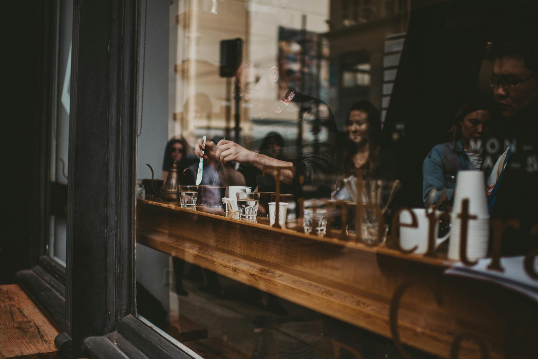
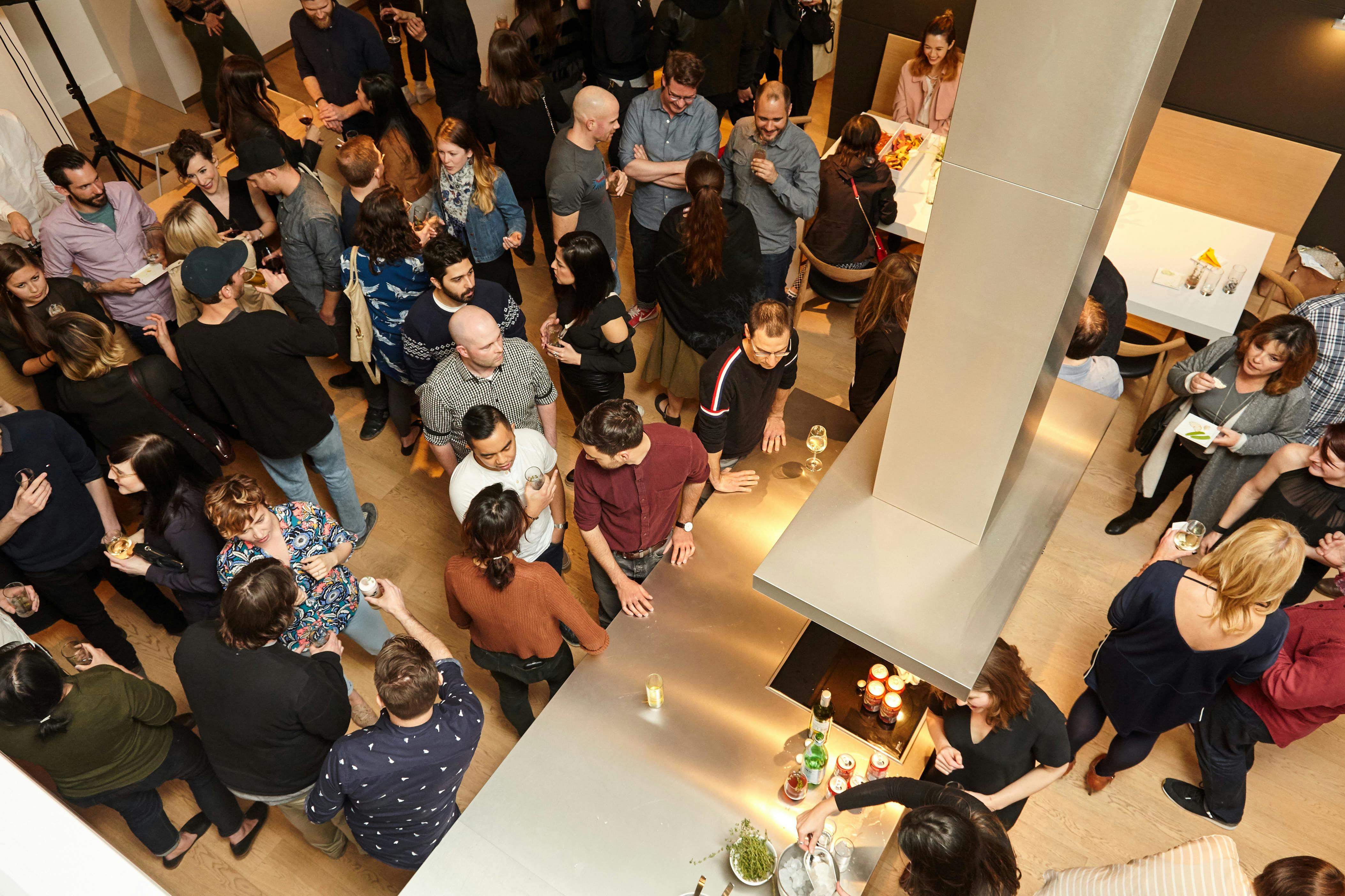
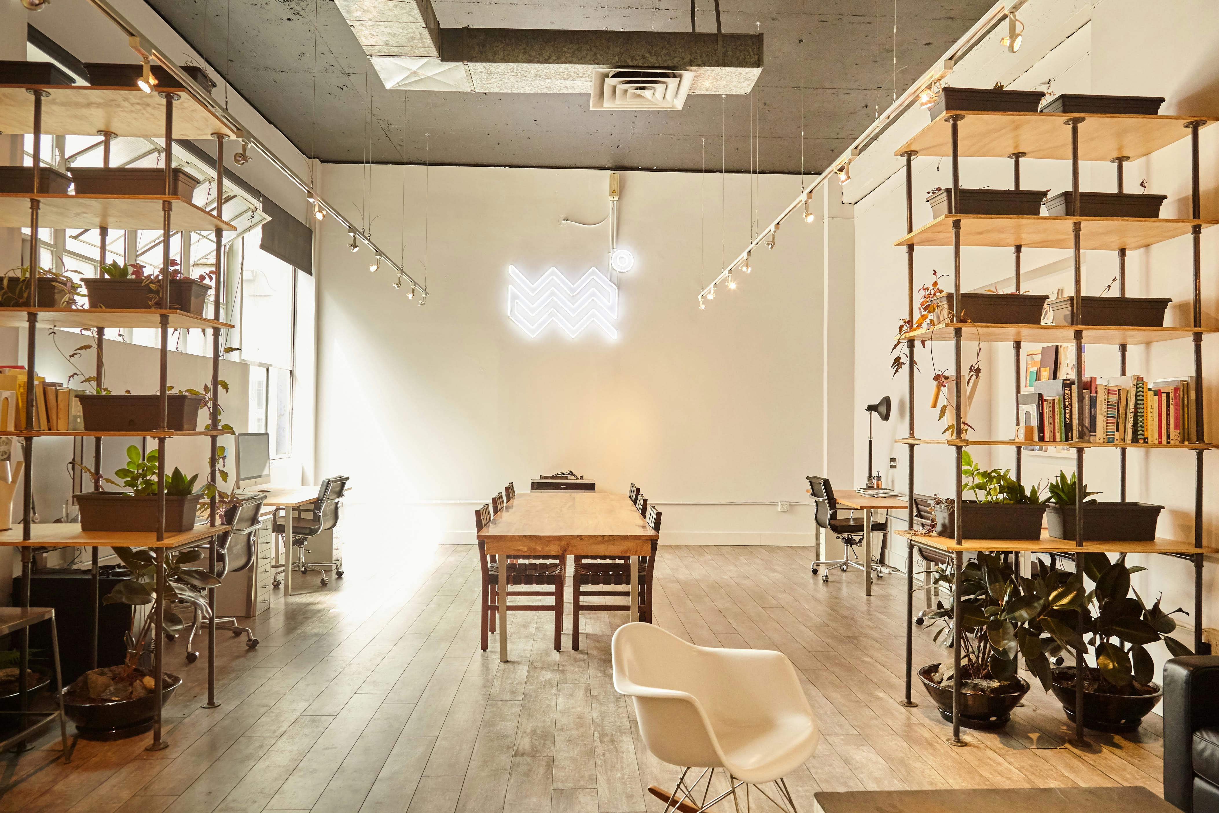
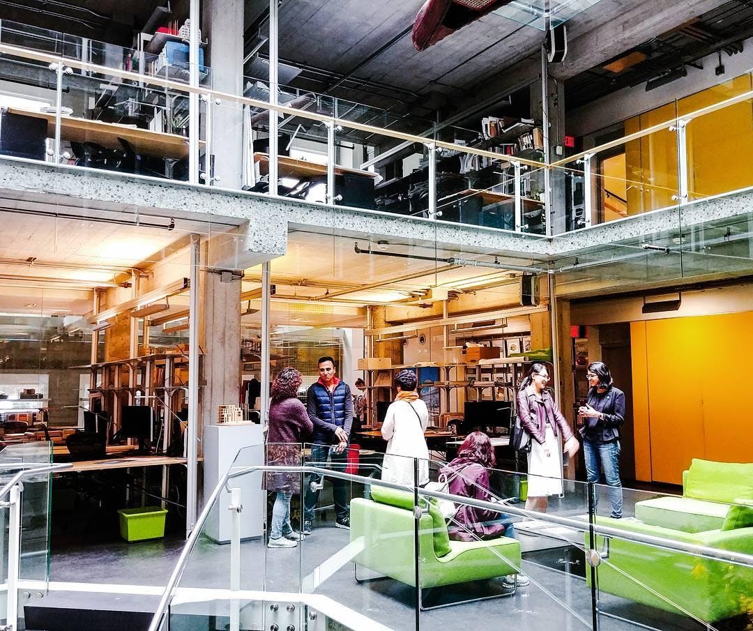


(Above) Some of the open spaces and events held over the course of Vancouver Design Weekend
What in your view defines Vancouver as a creative space? Is there anything specific you think creatives here do very well?
Tylor: I think sustainability as a topic is very relevant here, in different ways across a number of industries. A lot of architecture has a sustainable focus and this makes total sense given the location and the city’s connection with nature.
Todd: And it’s not at all theoretical for these guys. They are achieving great success by providing brilliant sustainable solutions to their clients. There is some great design that happens in Vancouver, such as Michael Green Architecture who produce both thinking and practice in sustainable wood-based construction.

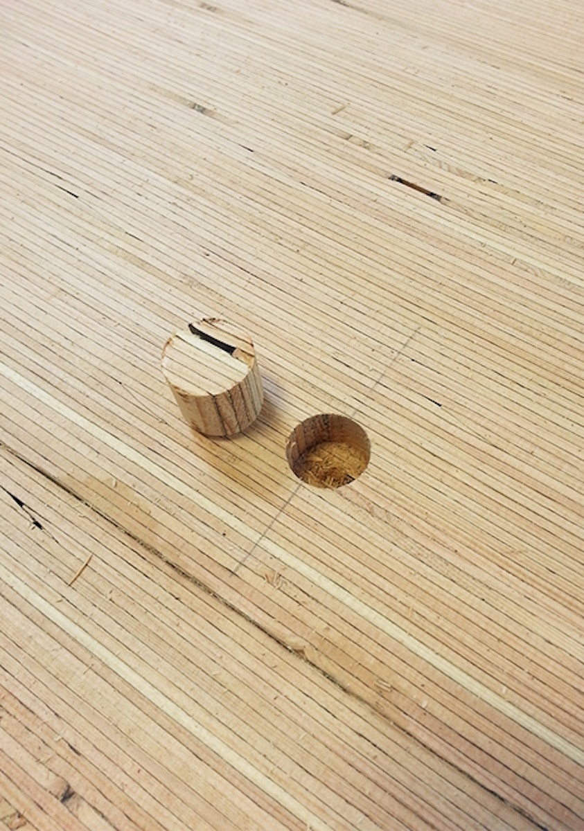
SHORELINE by Michael Green Architects. This project was the first in the world to use Brisco panels, a re-sawn LVL panel manufactured in Golden, BC. This mass timber product was used as columns, beams, floors, partitions and even stairs, creating a monolithic yet natural backdrop to the space.
Finally, I’m sure you’ve been asked this a lot but where does your name come from?
Tylor: We knew that we wanted to go with something that sounded tactile and was familiar to people. We were throwing around different materials that we liked and we felt fit with our vision. So we came to the conclusion that ‘Denim' represented the "maker" element of what we do; flexible and strong, and Steel represented the raw materials that we use; it’s architectural and has connotations with being very long lasting.
Todd: They are also very familiar materials and we wanted our work and our team to feel comfortable and approachable. They are materials that people trust as well as being long lasting and enduring… something we aim to achieve both as an agency and with the work we deliver.
- Todd & Tylor were interviewed and photographed by Samuel John Weeks
- https://denimandsteel.com - Check out Denim and Steel here ...
