


Words by SODA team
14 Aug 2024
Design in the Olympic and Paralympic Games: where would we be without it?
Many people don't realise the crucial role design has played in driving equality and accessibility across the Games, so we've unearthed the sporting event's rich history through the lens of creativity.
Since the Olympics as we know it began in Athens in 1896, the role of design in the event has expanded massively. From the graphic identity, uniforms and communications to the trophy, mascot and infrastructure, almost every element of The Games utilises creativity.
We’ve seen some of the most innovative designs yet at Paris 2024. The medals crafted by LVMH jeweller Chaumet were inspired by the hexagon, radiance, and gem-setting while the Torch, Relay cauldron and Olympic Cauldron were designed by Mathieu Lehanneur to represent equality fraternity and liberty.
Not only did design make it possible for the Games to have some of the most sustainable infrastructure yet - with plastic bottle seats and wooden pools - but also allowed the Olympics and Paralympics to present a fully integrated brand identity and mascot for the first time, created by W Conran Design.

A Symbol of Unity
This year’s event marks a century since France first hosted the games in 1924, though the country’s involvement in designing the Games began even earlier. One of the most recognised symbols of our time - the Olympic Games logo - was designed by Baron Pierre de Coubertin in 1913. Pierre de Coubertin was an aristocrat, who created the International Olympic Committee (IOC) in 1894 and was also secretary general of the Union of French Athletic Sports Societies (UFASS).
The Union of French Athletic Sports Societies logo
Two intertwined and flat blue and red circles make up the logo for the UFASS, which inspired the Olympic Games logo. De Coubertin’s goal was to encourage the practice of sport among all men (women weren’t permitted to compete at the time), fostering peace between nations, and so the five interlocked rings represent the meeting of athletes from the five continents.
It is worth noting that the circle is one of the oldest symbols in the world and, though the Olympic Games as we know it today only began in the late 19th Century, the ancient Greek version can be traced as far back as 776 BC, making it a fitting shape to represent the event. The circle has also taken on many meanings throughout history - spiritual and otherwise - from unity and balance to stability and perfection.
The colours in the logo were chosen to reference those used in the flags of the participating countries. The idea was that each country could find at least one colour that resonated with them.
The evolution of graphic advertising
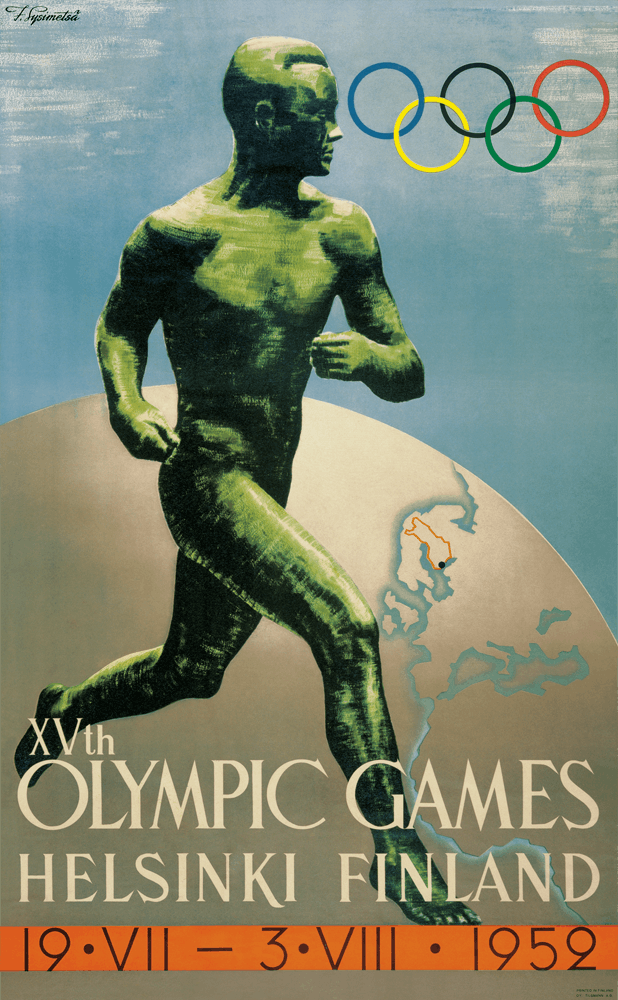
Posters became a standard medium of advertising The Games during the Stockholm 1912 event and since then, host cities have organised the creation of these materials via a competition for artists or designers from their nation. When the first Olympic Winter Games were held in 1924, Olympic posters started being produced for both Summer and Winter Games.
The Olympic Museum notes some occasions when the poster design came from other sources, such as Anvers 1920 when the official poster came from the cover of a book printed in 1914 called “Will we have the VIIth Olympiad in Anvers in 1920?”. Another occasion was in 1952 for the Helsinki Games, when the poster design that had been chosen for the cancelled Games of 1940 was revived.


While some Olympic posters include figurative elements that are significant for the host country (public monuments, statues, flags, landscapes or cityscapes), others put more of a spotlight on graphic elements or on the logo of The Games. According to The Olympic Museum, the more recent posters favour the latter, with text limited to the name of the host city and the year of the Games.


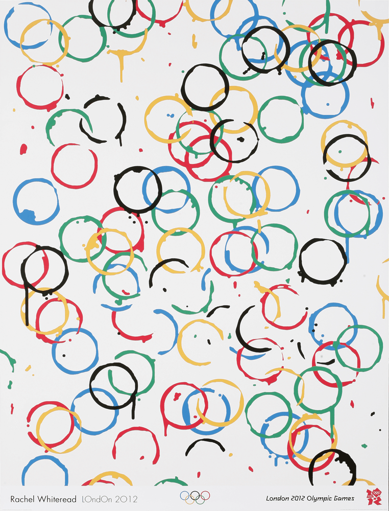
That being said, the official poster for Paris 2024 goes against this trend, created in conjunction with French illustrator Ugo Gattoni to be a dream-like portrayal of a stadium-city, echoing the slogan devised by W Conran Design: “Games Wide Open”.
When comparing Olympic and Paralympic posters, the latter have sometimes been more abstract in their design, such as Beijing 2008 and Rio 2016. Historically, there has been a lack of clarity and cohesion when it comes to marketing the Paralympics which only makes it harder to close the gap in funding and social perception between the two sporting events.


In designing one unified graphic identity, one mascot and one style of poster, W Conran Design and Gattoni have paved the way to putting the Olympics and Paralympics on the same podium.
Subscribe To Our Newsletter
Catch up on all the latest news from State Of Design Affairs right in your inbox.
Progressive Pictograms
Athletes from around the globe compete in the Olympics and Paralympics, meaning its audience is equally vast and diverse. The Games’ pictograms as we recognise them today were designed to communicate each sport in a way that everyone can understand and are somewhat evocative of early cave drawings produced thousands of years ago.
Before the Tokyo Olympic Games in 1964, the sports were illustrated in a much more complex style. The pictograms designed for the event in Japan, designed by Katsumi Masaru and Yoshiro Yamashita, set a new standard.

Credit: Markus Osterwalder at The Olympic Design Dot Com
They were not only easier to print on a practical level, but also much easier to interpret, no matter the language. Tokyo 1964 also marks the first time that the pictograms were truly genderless.
Although women have been able to compete since the 1900 Games in Paris, only 22 women out of 997 athletes competed in that first year. Even then, they were only able to participate in five sports: tennis, sailing, croquet, equestrianism and golf.
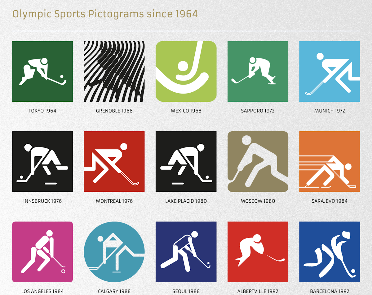
Credit: Markus Osterwalder at The Olympic Design Dot Com
In 1991, the rule was passed that any new sport seeking to join the Olympic programme must have women’s competitions but it wasn’t until the 2012 Games in London that women competed in all the sports on the programme.
The fact that 45% of the participants were women at Rio 2016 goes to show how far The Games have come in terms of gender diversity, with design helping to push progress every step of the way.

Paris 2024 Pictograms designed by W Conran Design
Each of the 62 pictograms for the Paris 2024 Games was designed by W Conran Design in the style of a coat of arms, going far beyond being a functional symbol to taking on a more emotional meaning. When you think of what a coat of arms represents, you think of pride, family and community, embodying what every athlete and supporter feels when competing in and watching the sporting events.
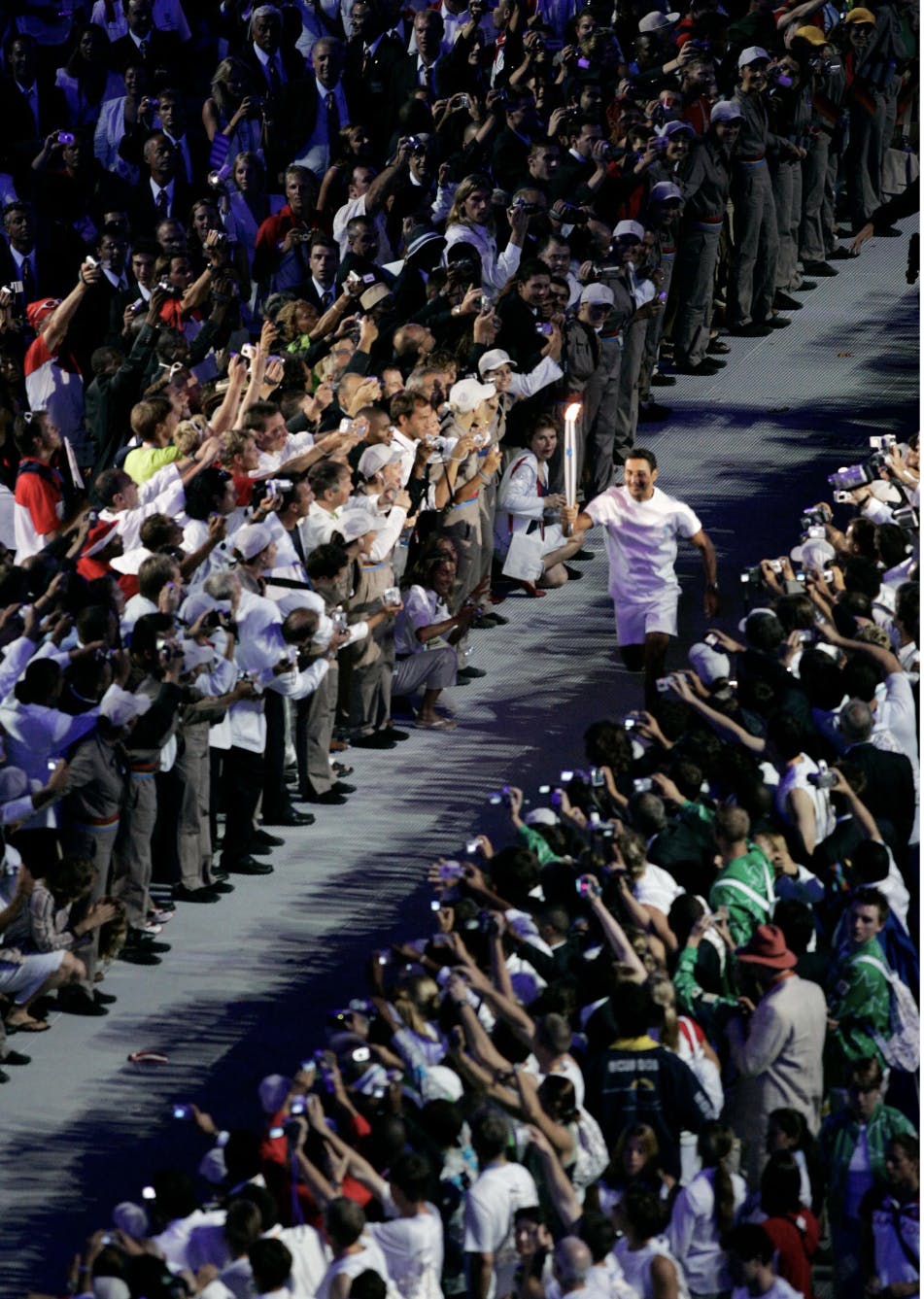
Carrying the torch for creativity
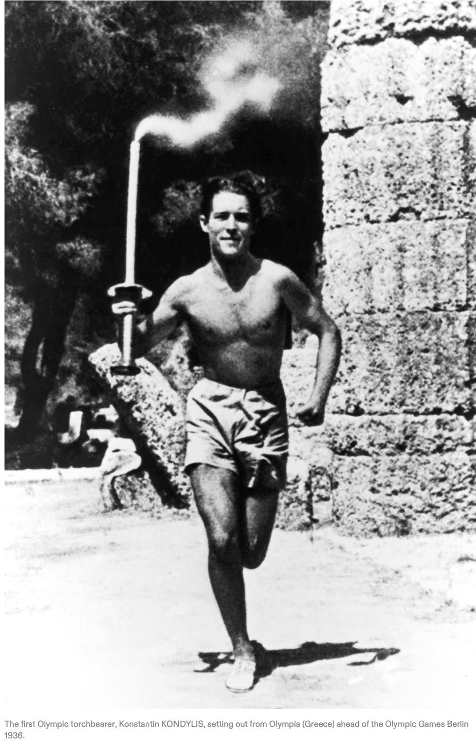
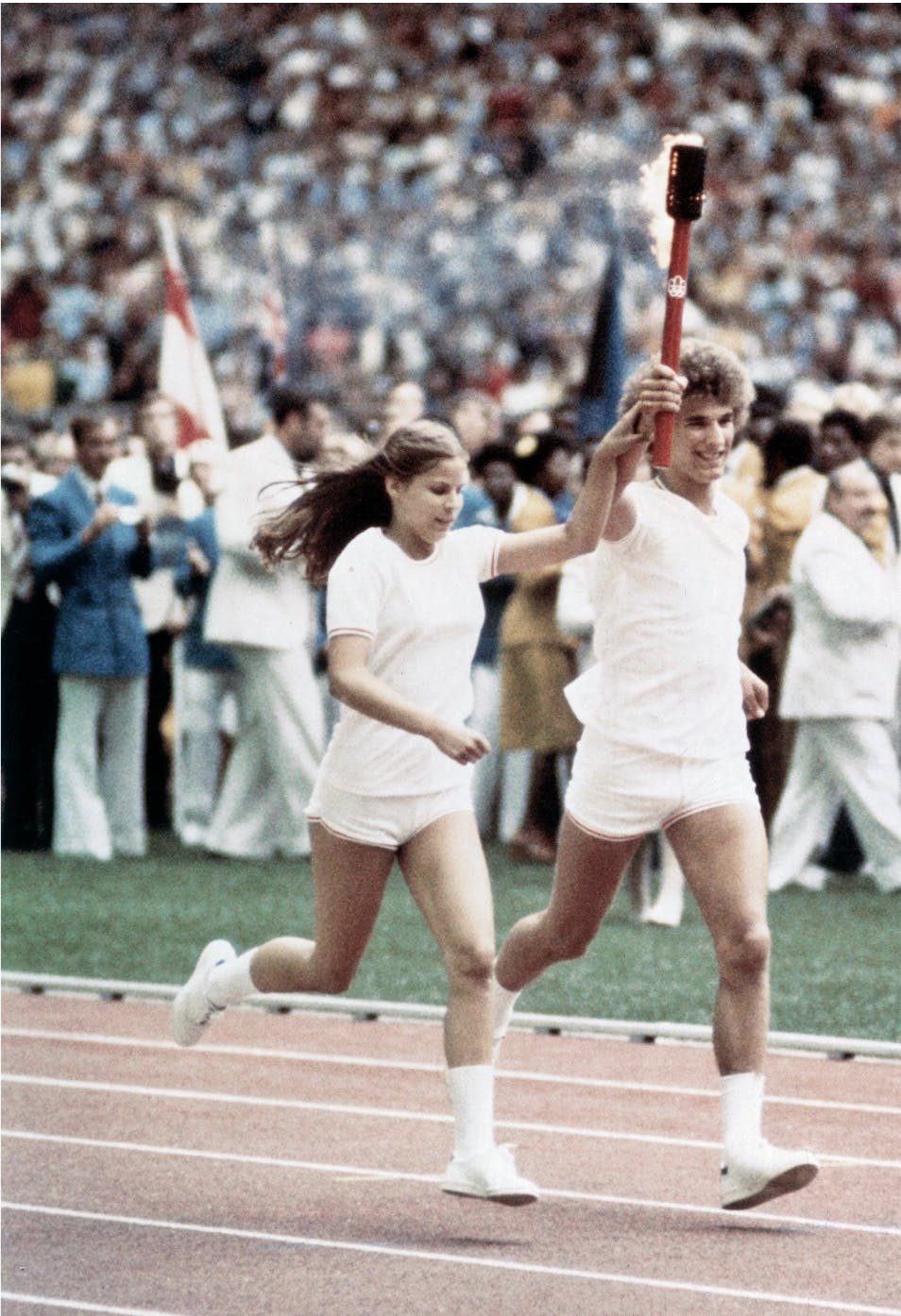
The Olympic torch relay has become something of a ritual and plays a crucial role in building anticipation for the main events. A torch was first used for the 1936 Berlin Summer Olympics during the opening ceremony and has since become a symbol of peace, unity and friendship, proving how the Games bring people together.
Designs for the torches over the years have varied massively, each with its own unique features that represent the host country in some way. In earlier Games, the torches were quite similar in shape and materiality, but Pier Luigi Nervi and Amedeo Maiuri stepped it up in 1960 for the Rome Games with a slender silhouette covered in bronze, a nod to the city's ancient history.


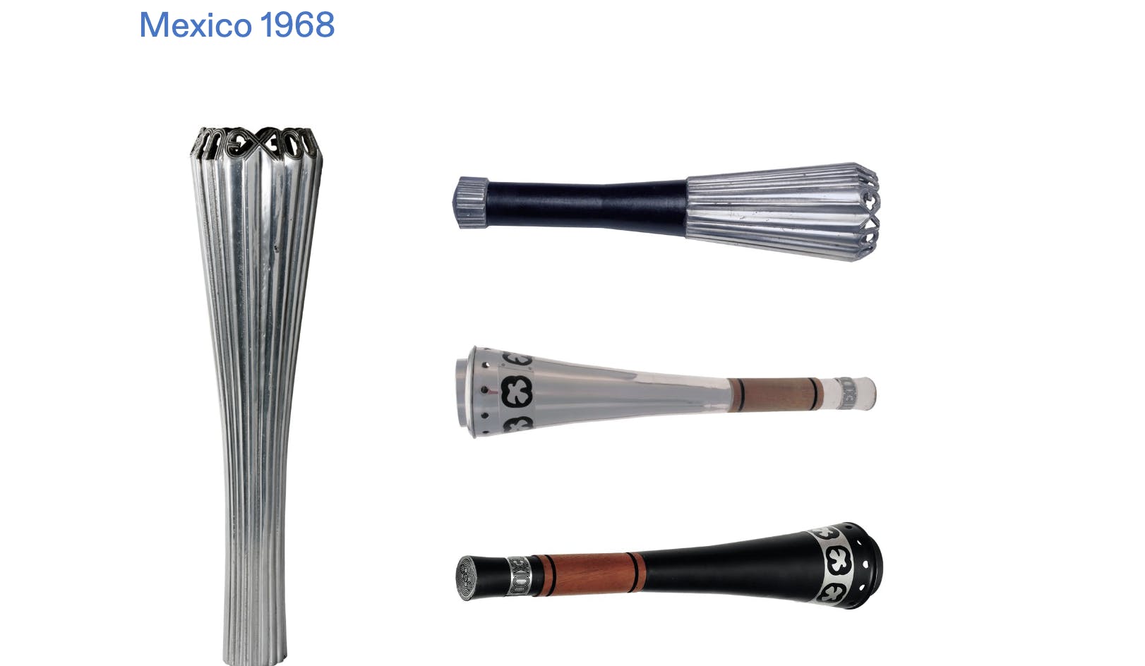
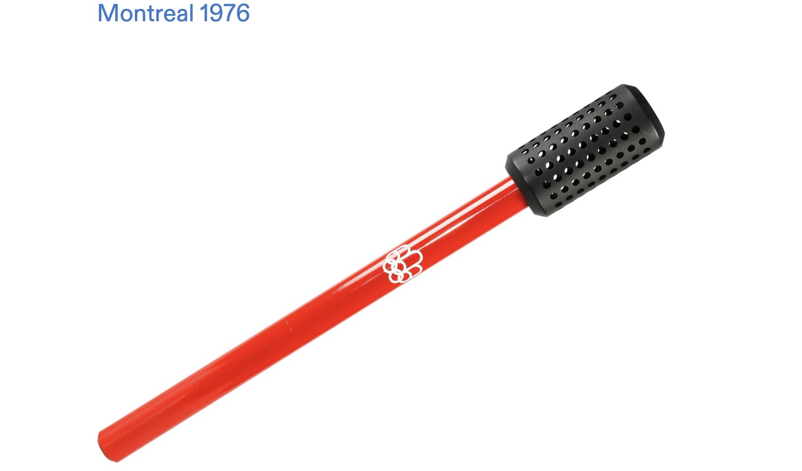
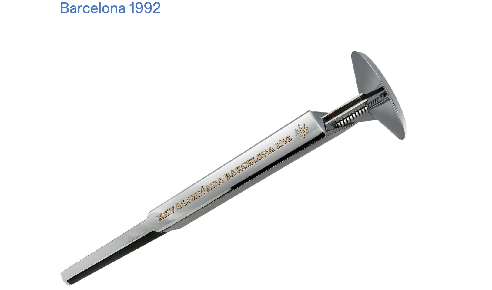
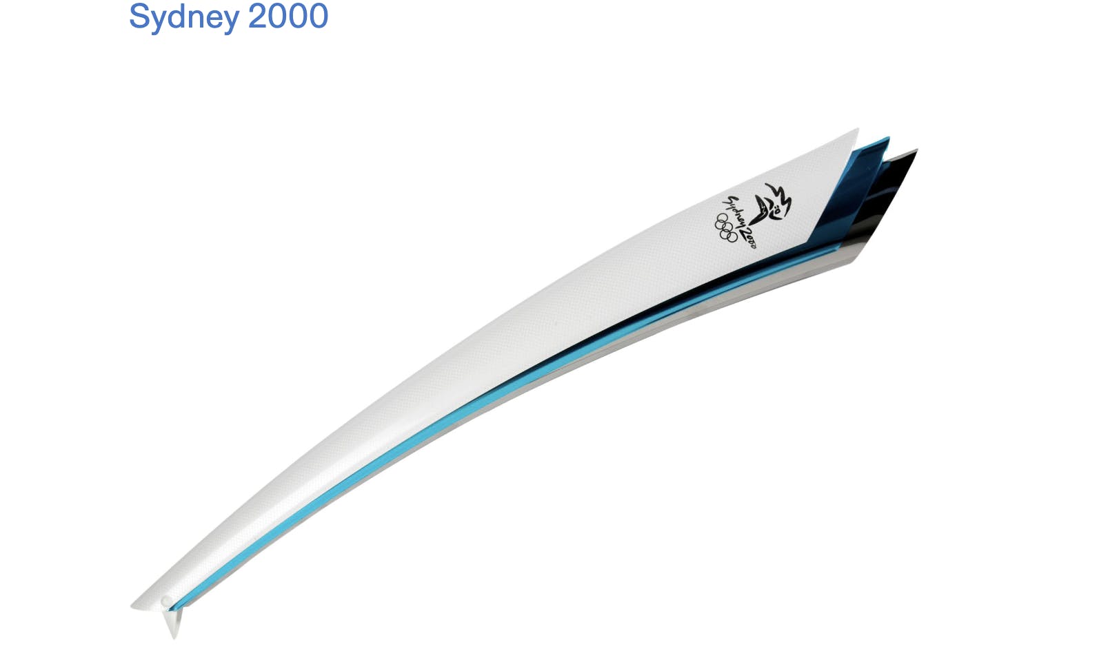
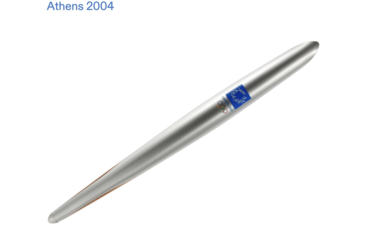
In the years following, the torch has taken many shapes and forms, from a potato masher and a microphone (Mexico City 1968 and Montreal 1976) to a flower pot , a boomerang, and an olive tree leaf (Barcelona 1992, Sydney 2000, Athens 2004).
Highlights from more recent years include the London 2012 torch, designed by Edward Barber and Jay Osgerby with 8,000 perforated circles to represent the number of torch bearers and Tokujin Yoshioka’s design for Tokyo 2020, which represented a cherry blossom ( a very different approach to the Tokyo 1964 torch, which was inspired by minimalist fashion and took the shape of a fencing sword).


For Paris 2024, French designer Mathieu Lehanneur designed the torch with three themes in mind: equality, water and peacefulness. The perfect symmetry of the torch represents the first of these themes, as equal efforts were put into organising the Paralympic Games as the Olympic Games.
It also ties in with Olympic and Paralympic Games sharing the same emblem, mascots, and torch design and references that, for the first time in the history of the Games, the same number of male and female athletes will take part in the competitions.

Mathieu Lehanneur and Tony Estanguet
The three-dimensional and vibration effects on the torch mirror the ripples and movements of water, which held a particular symbolism at the Paris 2024 Games. The torch travelled across the Mediterranean Sea aboard the Belem and went on a voyage across the Atlantic, Indian and Pacific Oceans in the “Relais des Océans” to reach six overseas territories: Guadeloupe, French Guiana, Martinique, French Polynesia, New Caledonia and Réunion.
The natural pattern also references Paris’ infamous Seine river, which played a pivotal role during the Olympic Games Opening Ceremony and served as the natural venue for Olympic and Paralympic events.


Peace has been a core pillar of the Games since Pierre de Coubertin’s time and was conveyed this year through the curves and rounded lines of the torch. It reminds us how important the Games are as a conduit for community and how, even in a time of war and political unrest, sport can bring people together with the help of good design, of course.
- Poster and Pictogram Images by Markus Osterwalder: The Olympic Design Dot Com
- Olympic Torch Images by Olympic Museum: The Olympic Studies Centre