Words by Abbey Bamford
13 Aug 2024
The SPLASH
From a workspace connected to nature to a pair of films that show AI's climate monitoring potential, here are SODA's favourite recent projects and initiatives from the design and creative industries.
A running club with charm
Freelance brand designer Dom Edwards is passionate about design, sports and community, so when the opportunity to brand runner and influencer Jonny Davies’ run club came about, it was the perfect partnership. Davies’ club, Scrambled Legs, had started to gain quite the following and he needed a brand that would help him on his mission to bring people together.

Speaking on the branding, Edwards says: “Sometimes literal works. I came up with a bunch of different ideas, but how better to visualise the feeling of scrambled legs after a long run, than an illustration of some wibbly wobbly legs?” The egg theme continues through the brand’s yolky yellow, setting it apart from the sea of monochrome dominating the running scene.
"As a designer, it’s not very often that you get to wear or even see your designs in real life, and being a huge fan of social running, it feels awesome. I often doubt my own illustration skills, but hearing the community say they love the little legs puts a smile on my face every time" says Edwards.

Connected co-working

Creative studio Raw Clay recently designed the identity and interiors for new coworking concept Soulspace, housed in a three-storey building on the banks of the River Wey in Guildford. The brand was designed to be harmonious with the building’s beautiful natural surroundings, and so the team used analogue methods for the initial logo mark design.
Using continuous lines to create the logomark and supporting illustrations, Raw Clay formed shapes with pieces of string before digitally tracing them, to capture organic, flowing movements. Creative Director Bekki Stovell explains how the founders want members to feel “a deep sense of belonging within their work environment, and the nature that surrounds it”.


Soulspace’s connection to the river was an important reference for the interior finishes, comprising stone, clay and wood. The team also developed a brand pattern made up of collaged, rock-like shapes, cut from old wildlife magazines.
360-degree packaging innovation
Brand design agency Lewis Moberly has created Sourglass from the Fitzwood Brewery, a beer design concept developed in collaboration with the international Make a Mark initiative. The project aims to explore packaging innovation from a 360-degree perspective to include glass, labels, foils, and design, so the studio chose to challenge the beer category norm by redefining the drinking experience and commodity perception.
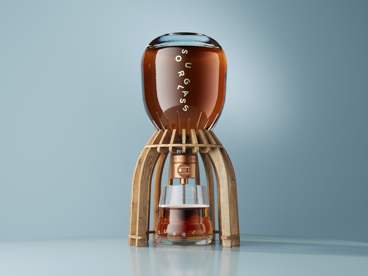
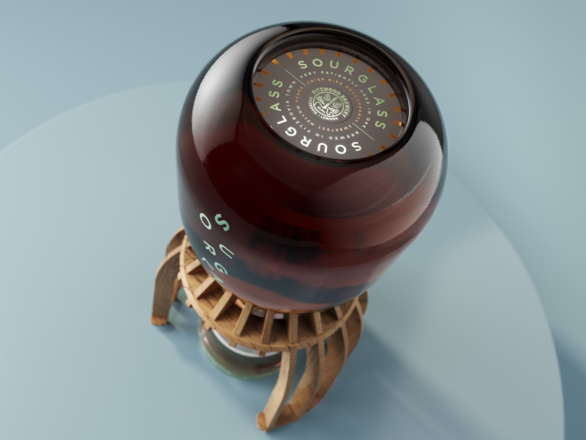
Sourglass’ unique bottle structure, secondary frame, and the name itself is inspired by the traditional hourglass, while the bespoke glass bottle inverts on the outer oak frame to serve and pour a perfect measure of beer. Lewis Moberly production director Mark Tosey: “The bottle structure is inspired by the hourglass profile made using 100% recycled glass and the outer frame structure is sustainably sourced from used oak casks in which the beer is aged.
“This acts as a protective case, a cradle platform for the inverted bottle, and as a centrepiece for serving. The refillable bottle has a custom closure, made from repurposed copper from the brewery, that delivers a slow-release pour.”

Subscribe To Our Newsletter
Catch up on all the latest news from State Of Design Affairs right in your inbox.
Consumer mindset in a corporate industry
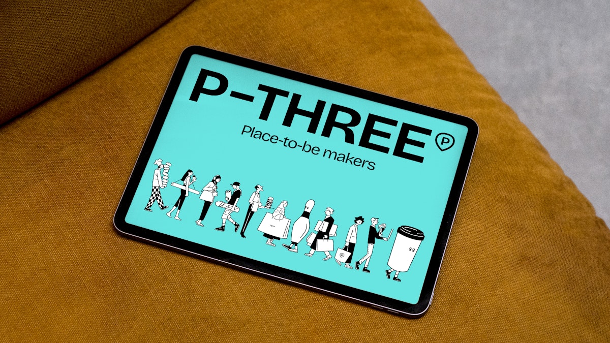
When you think of a standard corporate leasing agent brand, you probably wouldn’t get too excited. But leasing agency P-Three has broken sector conventions, working alongside strategic branding studio Without to speak the language of foodies, shoppers and leisure lovers, not bricks-and-mortar.
P-Three’s new strapline - ‘Place-to-be makers’ - allows for tailored messaging across client communications, like “Making Bankside Yards the next place-to-be”, or thematic variations such as “A place-to-be active” and “A place-to-be indulgent”. A series of illustrations by Peter Ryan are woven into headlines, logo applications and other corporate communications, breathing life into high street characters and the world of leisure, retail, and restaurants.

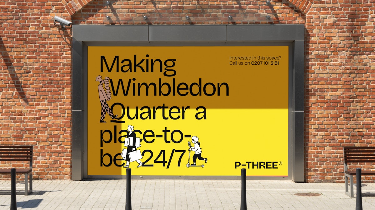
The font Bricolage Grotesque, designed by Mathieu Triay, was chosen for its intellectual, editorial feel, alongside some playful, human touches. Speaking of editorial, Without also created a newspaper to announce the new brand, which was circulated to current and prospective clients.
Exploring AI’s impact on climate
The all-female team from 3D motion studio Dada Projects has teamed up with Google DeepMind to create two films showing how AI can provide a deeper understanding of global warming and its impacts on ecosystems. As well as this, they explored AI as a tool for the prediction of extreme weather.
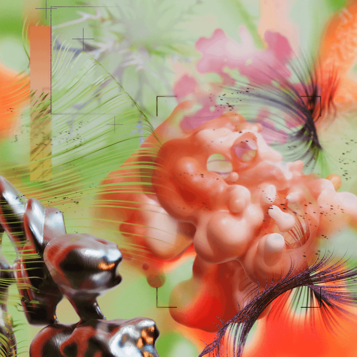

Taking inspiration from conversations with scientists, engineers, researchers, and ethicists, Dada Projects communicated Google DeepMind’s use of AI to enhance climate modelling, comprehend climate change patterns, and improve forecasting of extreme weather events, helping communities around the world prepare and respond.
The first film, titled AI for Sustainability, highlights AI's ability to provide insights into global ecosystems on various scales, emphasising its role in analysing vast real-time and historical data to predict and mitigate risks, especially in preserving vital marine ecosystems like algae's efficient CO2 absorption. The second depicts various stages of weather scenarios in this film, showcasing AI’s crucial role in forecasting disasters.

- Scrambled Legs by Dom Edwards
- Soulspace by Raw Clay
- Sourglass by Lewis Moberly
- P-Three by Without Studio
- Visualising AI by Dada Projects
- https://deepmind.google/discover/visualising-ai/ - Google DeepMind - Visualising AI
