Words by SODA team
28 Oct 2024
The Splash
A North Carolina project's adaptable identity, a suite of beautiful travel book covers and a beachy burger brand from Devon feature in this month's SODA SPLASH.
Hove's most dog friendly cafe
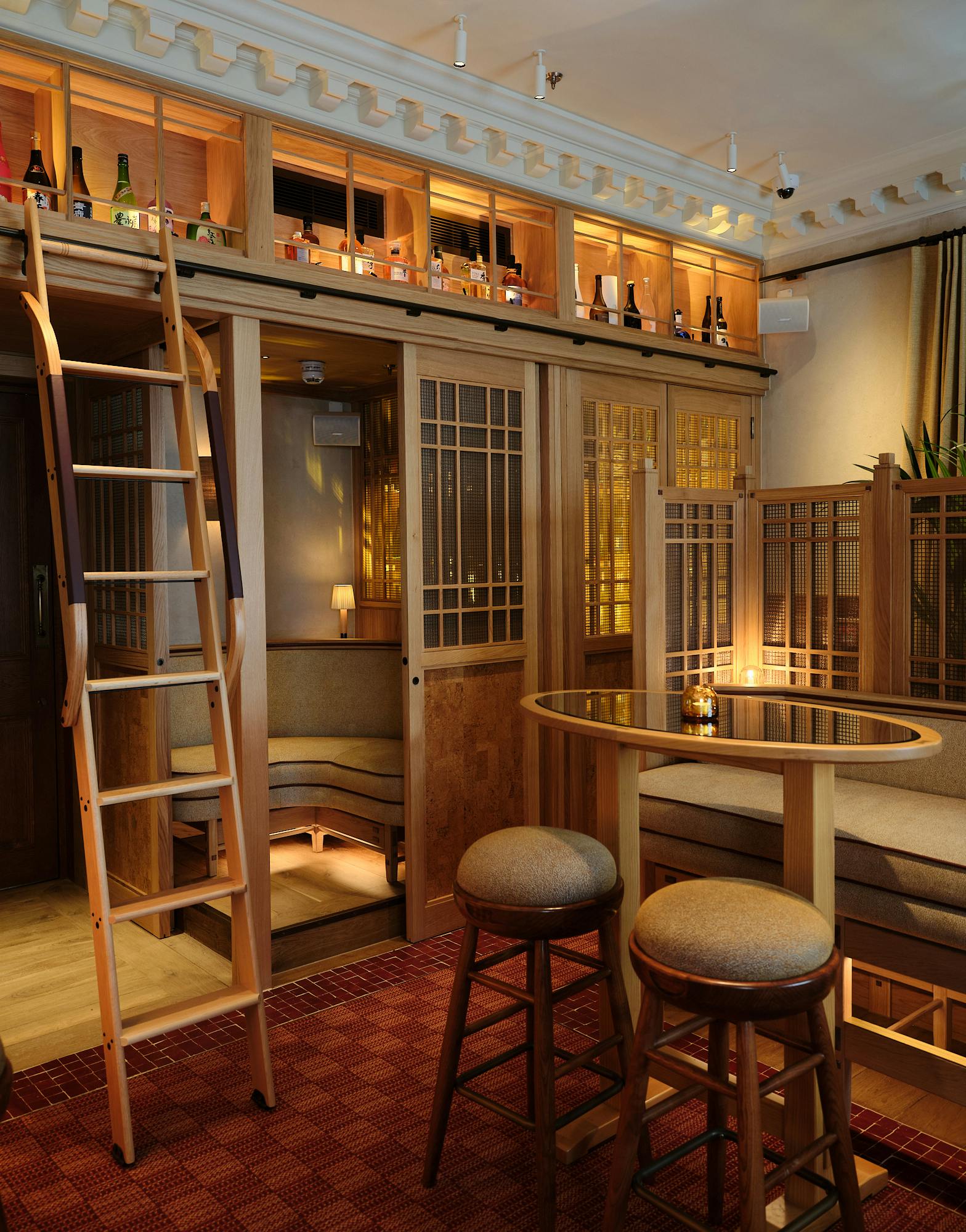
Brighton-based design agency Good Noise recently crafted the identity for Chasing Rabbits, a new café which promises to be the most dog-friendly (and people-friendly) place in Hove.

As well as a simple, notable logo and distinctive typeface, Good Noise also designed a suite of bespoke icons that were be applied for wayfinding, internal signage and communication.
Engaging Interiors' Crispin William led on the spatial design, which takes inspiration from the founder’s love of mid-century furniture. The interiors are designed to be inclusive and use warm colours to create a calming environment.

Bringing American burgers to the Devonshire seaside
Traditional British seaside towns are peppered with food options, but tourists often lack a solution for real quality or an aspirational destination. That is where Bob’s comes in: premium American-style patties and unlimited topping choices, bringing a quality smash burger to the beach.
Designed by Unfound studio, the branding nods to the authenticity of a real American burger while acknowledging the unique setting that this brand occupies—the Devonshire seaside. It was important for tourists to know what they were getting; this isn’t the time to be intriguing or abstract, so there is a matter-of-fact nature to our branding. Lines like ‘Build. Bite. Beach.’ create a simple, action-oriented brand taglines that guide the customer through the process, white the colours are a slightly more vibrant take on the traditional American diner palette.


Bob, the mascot, bridges the gap between the company and the consumer. The illustration not only signposts the brand but also provides a memorable asset that can appear across digital platforms, merchandise, and products. Finally, the burger spot is run by young, seasonal staff, so the brand had to reflect that. Nodding to surf culture with lines like ‘Beach Bun,’ the brand leverages humour in multiple ways to foster positive emotional responses and reflecting the laid-back culture the brand is part of.
A testament to culture and creatives
GeerHouse is a new mixed-use project located in Durham, North Carolina, a district renowned for its historical significance and mid-20th-century industrial architecture.
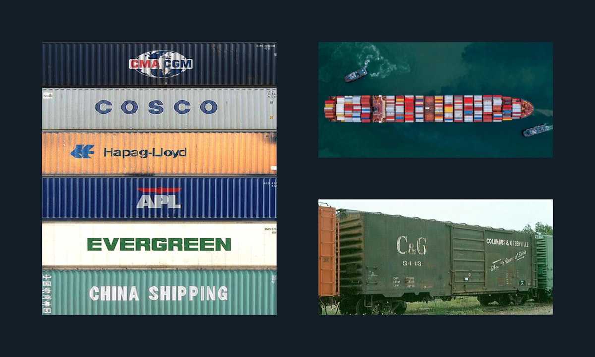
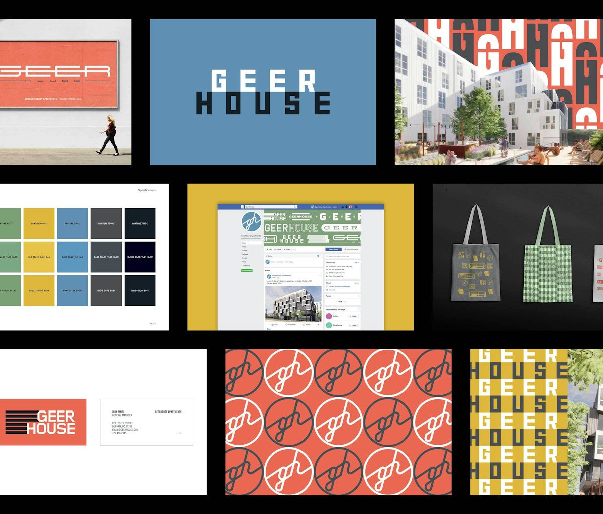
For its identity, Chicago-based studio Span drew inspiration from the vernacular graphics of shipping containers and train cars, creating a suite of logos that can be mixed and matched to give Geerhouse a flexible and adaptable branding system.
Span also designed a comprehensive set of brand materials, including banners, stationery, promotional items, and website. The goal was to ensure that every touchpoint of the brand conveyed the energy and spirit of the development and its community.
A trip to the Mediterranean

UK-based illustrator and pattern designer Martha Olivia caught our eye this month with her playful yet carefully considered designs. Her work is rooted in pattern and often inspired by themes of nature, culture and dreamlike scenes, like her latest self-initiated projects: a new set of travel book cover illustrations. Using both digital and analogue techniques, her work consists of layering foliage while building up shading and detail to create immersive and bold designs full of intrigue.
Martha's broad and multi-disciplinary portfolio demonstrates her ability as a versatile designer, with work suiting a wide variety of outputs from editorial pieces to product packaging, interiors and textiles.
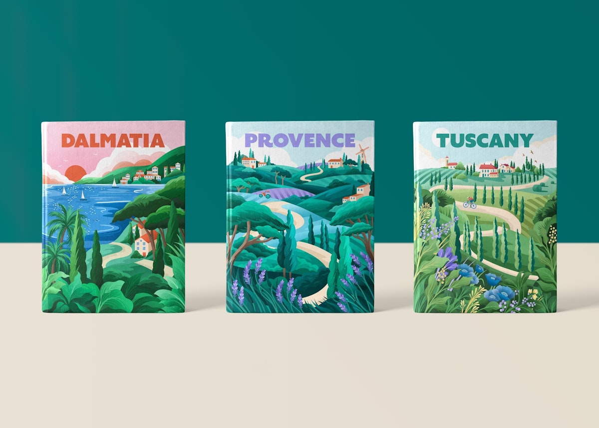
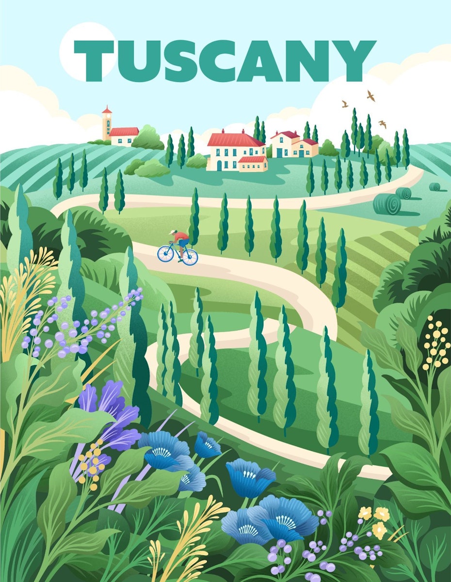
The collection aims to capture the essence and beauty of Tuscany, Provence and Dalmatia using vibrant contemporary colours, bold type and distinctive regional elements to transport the viewer to each place. The illustrations are inspired by Martha's love for travelling and exploring different landscapes and cultures and are designed to be collectable and proudly displayed.
Sensorial and sustainable self care
Singapore-based sustainable self-care brand Postcard has a new identity by Robot Food as it moves to redefine self-care as a deeply personal and emotional experience. Robot Food developed product names, such as 'Clear Skies' and 'Icy Peaks,' to reflect serene places in nature, along with a logo that features organic quirks inspired by vintage store signage.

The logo’s textured look and feel mimics hand-printing techniques, like stamps, creating an imperfect effect that reflects the brand's artisanal roots. Stamp illustrations bring out the personality of each product, adding a rich, exploratory nature to the brand.
These stamps are designed as a collection of postal stamps from around the world, inspired by a singular illustration style. They are intentionally simple, never too ornate or complex, as though they were sketches capturing moments from the locations they represent.

- Chasing Rabbits by Good Noise and Engaging Interiors
- Bob's Burgers by Unfound Studio
- Geerhouse by Span Studio
- Travel book covers by Martha Olivia
- Postcard by Robot Food
